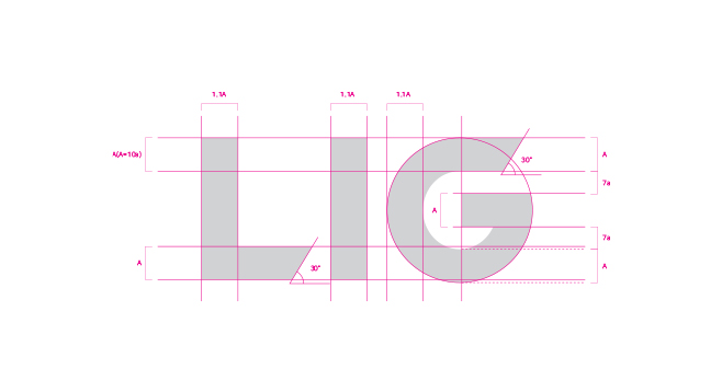
CI
We have incorporated LIG Defense&Aerospace’s corporate spirit and business philosophy in our CI.
The font using heavy and thick strokes represents LIG Defense&Aerospace’s stability based on its accumulated expertise and the trust of our customers.
Diagonal lines in the ‘L’ and ‘G’ signify the innovative direction we are heading and our growth into the future based on it.
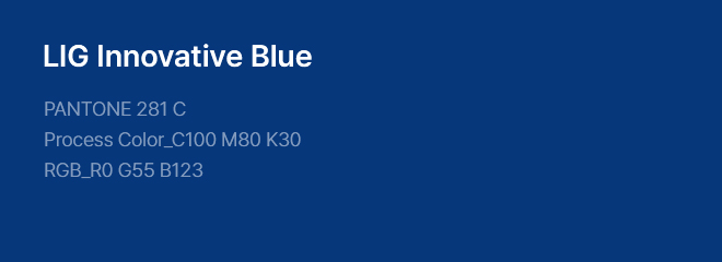
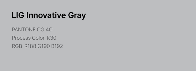
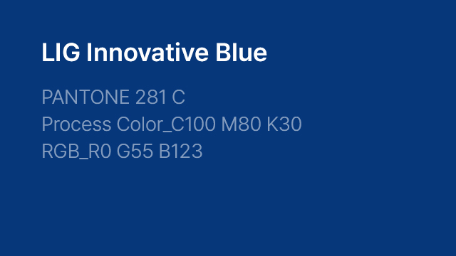
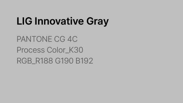
Dark blue and gray with a metallic and trendy feel are used to reflect the company’s cutting-edge technological clout and its image as a future-leading company.
Signature means the combination of word mark and logotype according to a certain rule, and it is not permitted to combine the elements at a user’s discretion.
Our word mark is a key symbol central to all visual communications representing the brand image externally and internally.
LIG Defense&Aerospace’s word mark and logotype (the company’s name) should be used separately and cannot be used in combination with each other.
As they are the main elements that represent LIG Defense&Aerospace, the text specified in the guide data should be used accurately and cannot be altered at a user’s discretion.
The CI is made up of a primary color and secondary color. Spot color printing is used in principle based on Pantone Color.